I’ve been working on ideas for the cover of my next book.
Last week, I blogged, here, about my first cover idea and today, I thought I’d share another.
The book is called Last September, formerly Countdown To Chaos–which I still think is an awesome title, but doesn’t quite fit this story as it’s an ironic piece of work–a stand alone prequel to my current novel, Between Octobers. (Click the above link and use this coupon code–EH33N–to download your free ebook)
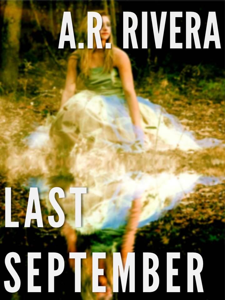
Option 1: (photo credit: morguefile, greyerbaby): I like this option because the Fall colors go along with the title and the duality of the girls reflection fits the story.
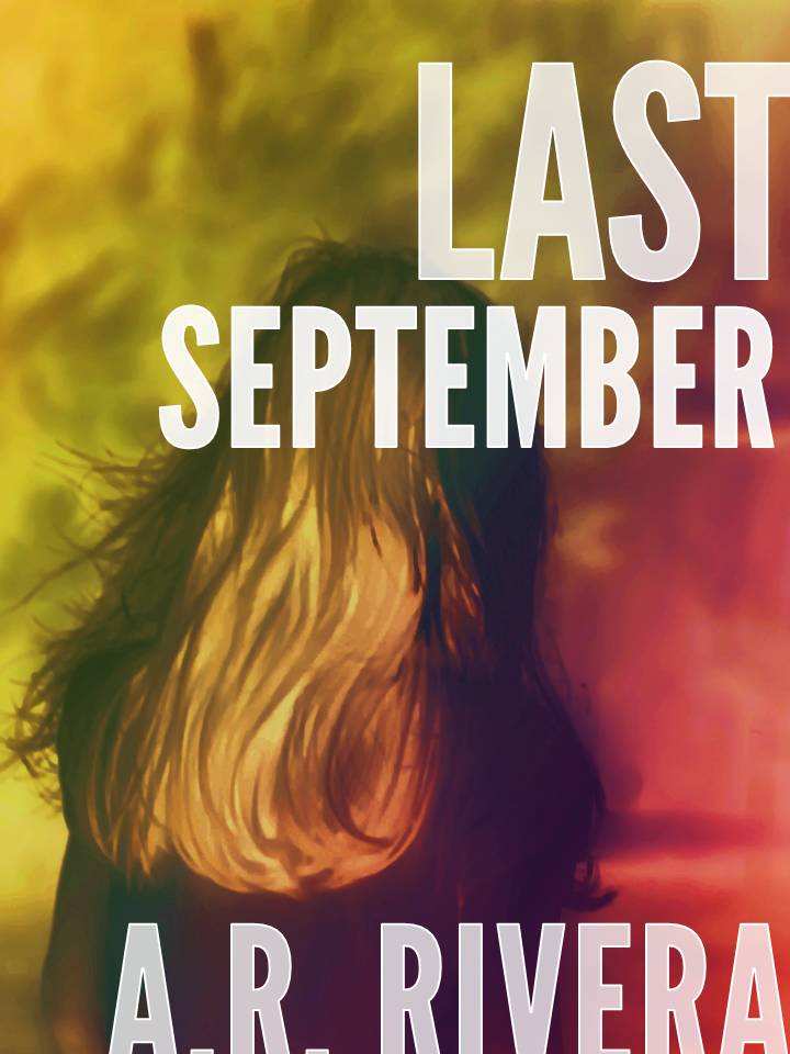
Option 2 (photo credit: morguefile, KellyP42): I like option 2 a lot.l The slightly off-the-canvas set of the letters and the odd coloring is both simpler than option 1, and fits the story well, too. And even though I was unsure about using this font on the first cover, I think it’s better suited in this one.
Each cover idea is very different. I’d love to know what you think of them. Maybe you can let me know which one catches your eye first?

I like the second one, font and all. I commented on font yesterday, but I like it with image 2.
LikeLike
Thank you for the feedback. You’ve been very helpful
LikeLike
For what it’s worth, I like Option 1. I like the almost-Impressionist ‘feel’ of the cover. And I like the full-on picture of the woman, rather than just part. I think the second is beautiful and would certainly sell books if you opt for it. But I like the first better – just my opinion.
LikeLike
Thanks Margot. You’re always so supportive of each one of my posts and I appreciate it very much.
LikeLike